Creating Compelling Slides: Bullet Point the Content or Read Scripts?
July 13, 2019
Marie I. Rose | IBL News
One of the most time-consuming tasks in instructional design is creating slides.
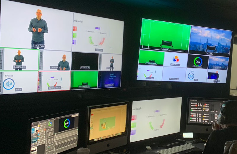
Slides are the backbone of any course. We usually outline the talking points, script the visuals and convey important information for the students.
Many times slides are accompanied by texts to be teleprompted by lecturers. This mostly depends on their personality and teaching style.
The dilemma is whether to bullet point the content or read scripts.
However, one requirement is certain: we need to create killer visuals. Layouts, texts, pictures, icons, videos, graphics, animations, colors, and fonts need to be compelling. And flipping through slides (Keynote or PowerPoint) should result in an engaging teaching experience.
Let us share some of our recommendations when designing slides:
- Choose wide-screen format 16:9.
- Use bullets or very short sentences. Do not add paragraphs of information on your slides: learners become distracted and stop listening. Use multiple slides for a topic if the content is too long.
- Pick sans serif fonts: they are easier to read and seem more friendly. Some of the classics are Arial, Geneva, Lucida Grande, Tahoma, Trebuchet MS, and Verdana.At IBL our favorites are Roboto, Open Sans, Lato, Fira Sans, Libre Franklin, and Karla… Never Helvetica!
Regarding size, use fonts larger than 22 points.
The Fontsquirrel.com website includes many free fonts.
- Choose 2-3 colors to that work well together. Use the color palette combinations or pick your brand’s color if the course is an extension of your activities. Adobe has a good color picker. Coolors.co is another good generator.
- Stock Image Websites: We use a commercial one, Shutterstock, but there many free ones. Here is a list: Pexels, StockSnap, Unsplash, Gratisography, Finda.Photo.
Discover more
IBL News is funded by the New York-based, family-owned company ibl.ai. Our stories adhere to the highest ethical standards in journalism and are available to news syndication agencies.