Coursera Removes the Infinity Icon from Its Logo Wordmark
December 17, 2020
IBL News | New York
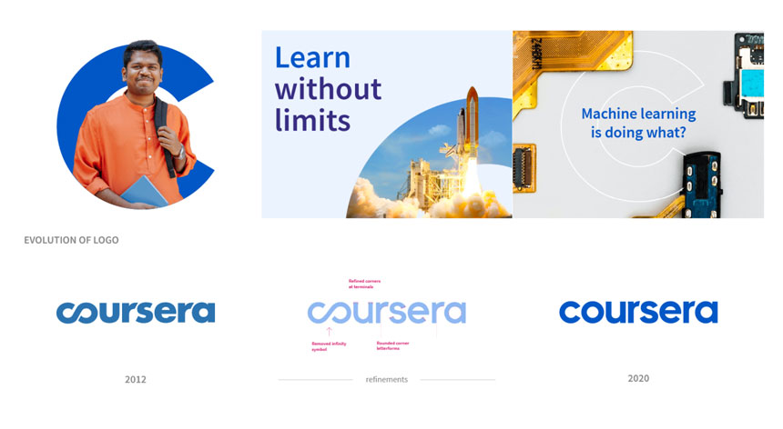
Coursera unveiled this week its new brand identity “to reflect its growth” and “be clearer about who we are and why we’re here—for our learners, our partners, our customers, and the world.”
That graphical change—which might be imperceptible to the user—is essentially based on removing the infinity symbol the company was using on its wordmark. Now Coursera starts with a C.
Stephanie Hale, Director of Brand at Coursera, explained in a blog post: “The C is an entry point into the full span of learning opportunities on Coursera—from projects and free courses to Professional Certificates and degrees.” She added: “The C spotlights a world of possibility and provides a path for learners from discovery to outcome.”
Selected typefaces are Source Sans Pro and Noto Sans Pro.“These typefaces support 582 languages and provide optimal upload and download speeds across devices and browsers for offline learning.”
Discover more
IBL News is funded by the New York-based, family-owned company ibl.ai. Our stories adhere to the highest ethical standards in journalism and are available to news syndication agencies.